In today’s fast-paced business world, time is a valuable resource. We’ve been diligently observing our users and are delighted to share that our clients have reported spending over 50% less time on Transfer Pricing documentation over a period of three years by using TPGenie.
Introducing the Time Comparison Graph
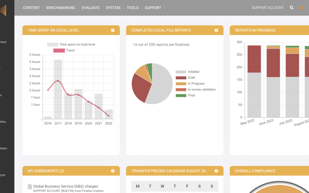
Building on the insights gained from our users’ experiences, we are excited to announce our latest feature – the Time Comparison Graph. This new addition on the TPGenie dashboard for Transfer Pricing managers, provides an intuitive and informative representation of the amount of time spent on reports using the Survey feature by local users over different fiscal years (FYs).
Understanding the Graph
The Time Comparison Graph showcases the evolution of time spent on reports over multiple fiscal years, aiding in the identification of consistent reductions in effort compared to previous year data. By analyzing this graph, users gain valuable insights into the efficiency and productivity improvements achieved in report generation over time.
Graph Axes
- Y-Axis: Average Time per Report – The vertical axis represents the average time spent on each report. Higher bars indicate more time was required to complete reports during that specific fiscal year.
- X-Axis: Fiscal Years (FYs) – The horizontal axis displays the fiscal years, with each bar corresponding to a specific FY. This enables users to observe changes in time spent on reports over time. The number of reports is indicated when clicking the bar.
Trend Line
The Time Comparison Graph is enhanced with a trend line that provides an overview of the overall trend in the data. A downward slope of the trend line indicates a reduction in average time spent on reports as fiscal years progress. This reduction signifies improved efficiency in the report generation process or the implementation of other enhancements.
Examples of TPGenie clients
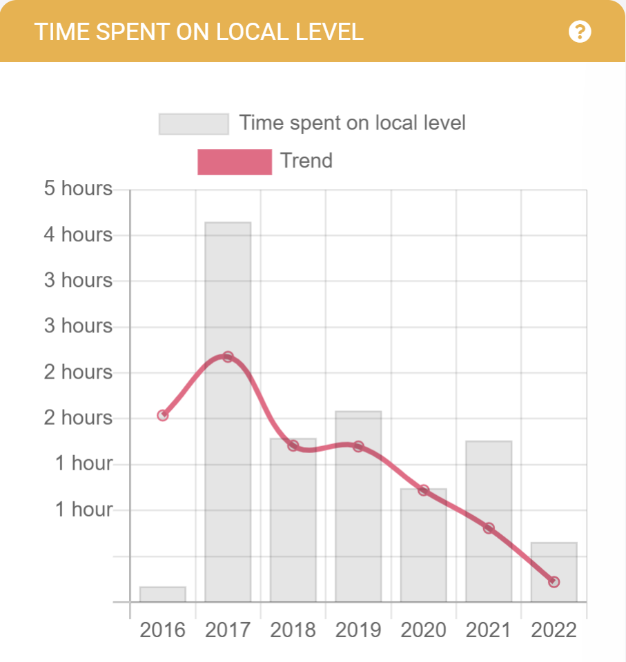
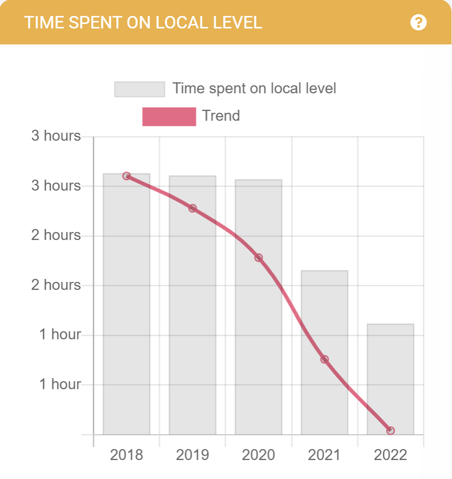
The below graphs are screenshots of three TPGenie MNE clients. As you can see the reduction of time spent is substantial.
 |
 |
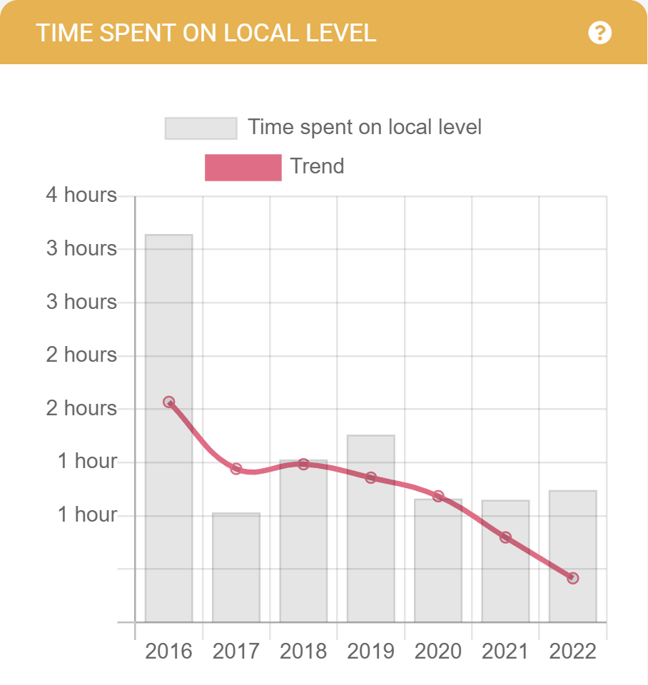 |
| MNE operating in chemicals with +/- 300 subsidiaries. | MNE operating in beverages with +/- 600 subsidiaries. | MNE operating in machinery with +/- 70 subsidiaries. |
The Time Reduction Journey with TPGenie:
The remarkable reduction in time spent on Transfer Pricing documentation with TPGenie can be attributed to a combination of factors. Let’s explore the key reasons:
- Streamlined Onboarding Process: In the initial year of using TPGenie, the onboarding process requires time for preparation and data entry. Users need to fill the tool with relevant data, such as local file blueprints and inter-company transactions. However, this is a one-time exercise. Subsequent years benefit from this initial investment, resulting in a significant reduction in the time spent on onboarding.
- Accelerated User Training: As users start working with a new software tool like TPGenie, there is an initial learning curve that requires training and familiarization. However, as they become accustomed to the platform’s intuitive interface and features, the time spent on training decreases. This leads to increased efficiency and quicker adaptation to the system.
- Faster Validation Process: In subsequent years, users gain confidence and familiarity with TPGenie’s validation process for their local files. Automated data validation and artificial intelligence tools ensure quicker identification and resolution of discrepancies, reducing the time spent on reworking documents.
- Automated Report Generation: TPGenie’s powerful automation capabilities significantly streamline the report generation process. As users become acquainted with the tool’s functionalities, they can leverage automation to compile TP reports efficiently, minimizing the need for manual interventions and saving considerable time.
- Seamless Collaboration: TPGenie facilitates real-time collaboration among team members involved in transfer pricing documentation. The platform’s data sharing and commenting features eliminate communication delays, enabling quicker report finalization and approval.
- Updated Regulatory Compliance: TPGenie remains up-to-date with the latest regulatory requirements and best practices. Users can stay compliant without investing additional time in researching and adapting to changing regulations.
- Enhanced Data Accuracy: With TPGenie’s built-in Transfer Pricing reconciliation mechanisms, users can identify and rectify potential discrepancies early in the process. This reduces the time spent on reworking documents and ensures the accuracy of the final reports.
- Customized Templates and Reports: Over time, users can create and save customized templates and report formats that suit their specific needs. Reusing these templates speeds up the report generation process, further contributing to time reduction.
The Power of Insights:
With the Time Comparison Graph, users can easily track progress, measure improvements, and make data-driven decisions to streamline their TP documentation process. By identifying patterns and trends, businesses can implement targeted strategies to further optimize their workflow, saving time and resources.
At TPGenie, we are committed to continually improving our platform to meet our clients’ needs and exceed their expectations. The Time Comparison Graph is a testament to this commitment, offering valuable insights into the efficiency of the TP documentation process over time. Empower your business with data-driven decision-making, optimize your TP documentation process, and experience greater productivity with TPGenie’s new feature today!
Recent Comments